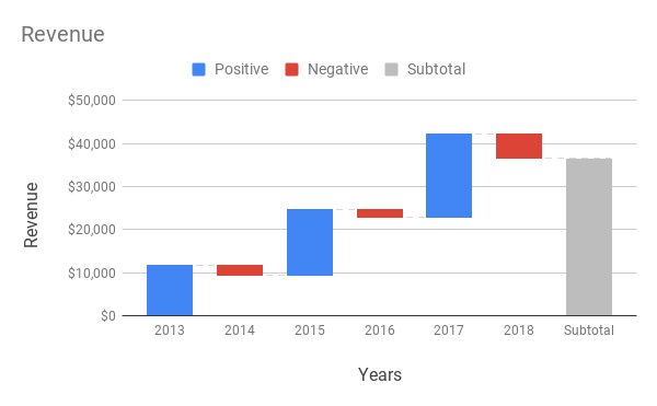
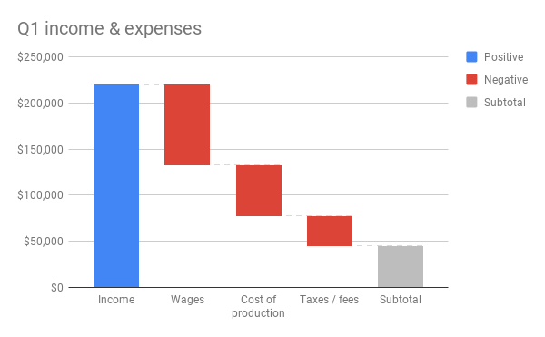
Use a waterfall chart to show how values add or subtract from a starting value. For example, show monthly net cash flow or quarterly budget changes.
Learn how to add & edit a chart.
How to format your data
- First column: Enter a label for each row. Labels from the first column show on the horizontal axis.
- Other columns: Enter numeric data. You can also add a category name (optional).
- Rows: Each row represents a different bar on the chart.
If you enter 2 or more columns of numeric data, you can choose to see the data sequentially or stack it.
Tip: If the chart doesn’t show the data on the axis you want, learn how to switch rows and columns.
Examples
Annual revenue

| Year | Revenue |
|---|---|
| 2013 | $11,690 |
| 2014 | -$2,350 |
| 2015 | $15,467 |
| 2016 | -$2,000 |
| 2017 | $19,560 |
| 2018 | -$5,970 |
Quarterly income & expenses

| Quarterly income & expenses | |
|---|---|
| Income | $220,000 |
| Wages | -$87,500 |
| Cost of production | -$55,000 |
| Taxes / fees | -$33,000 |
Customize a waterfall chart
- On your computer, open a spreadsheet in Google Sheets.
- Double-click the chart you want to change.
- At the right, click Customize.
- Choose an option:
- Chart style: Change how the chart looks, or add and edit connector lines.
- Chart & axis titles: Edit or format title text.
- Series: Change column colors, add and edit subtotals and data labels.
- Legend: Change legend position and text.
- Horizontal axis: Edit or format axis text, or reverse axis order.
- Vertical axis: Edit or format axis text, set min or max value, or log scale.
- Gridlines: Add and edit gridlines.